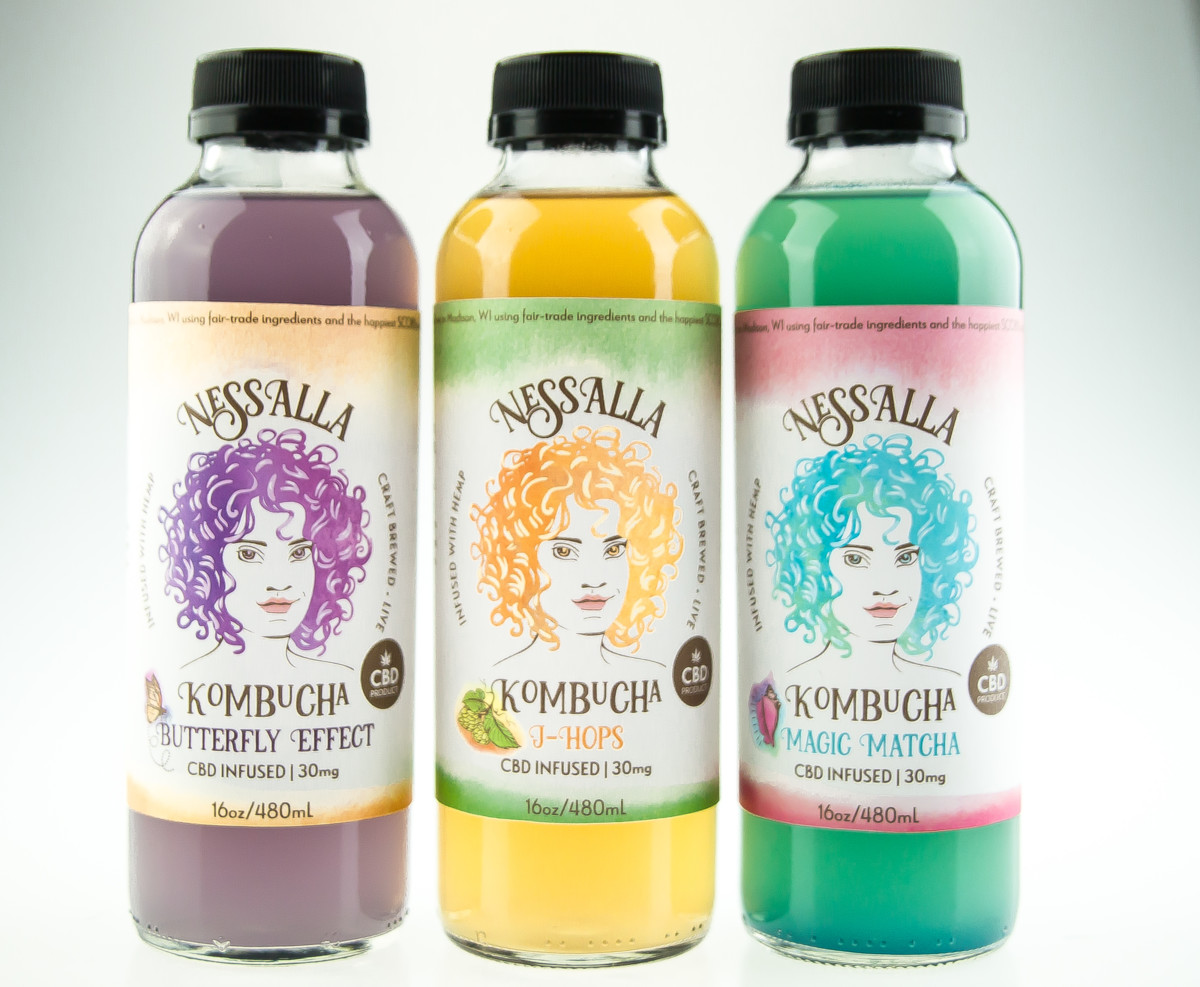
Recently, Dirigible Studio had the opportunity to create original artwork for NessAlla Kombucha’s CBD-infused kombucha.
Read more about NessAlla’s CBD-infused booch over on their gorgeous and well-made website.
Here’s what we came up with:

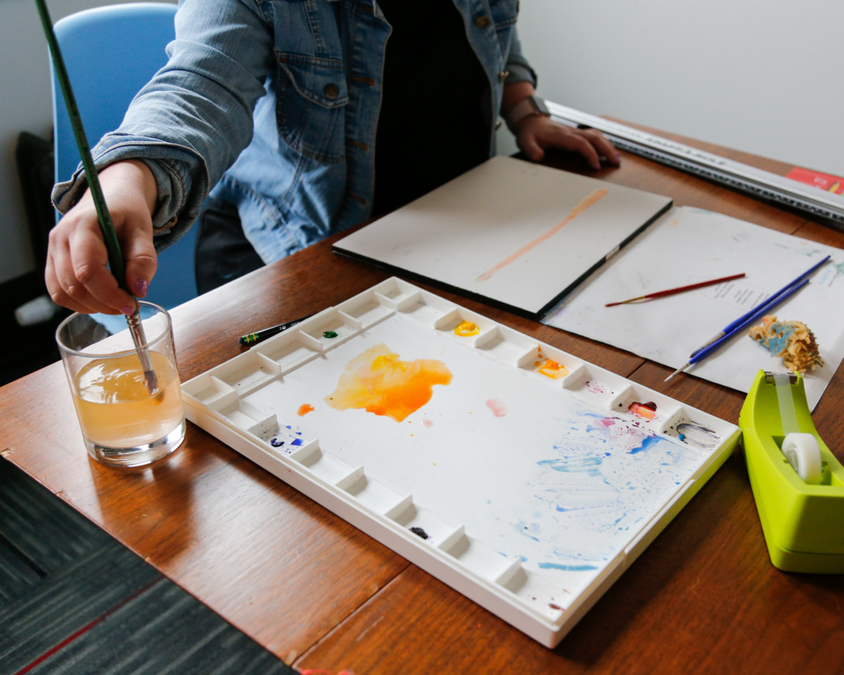
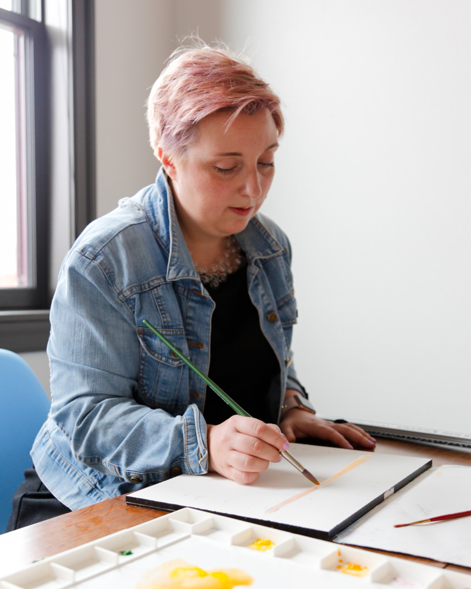
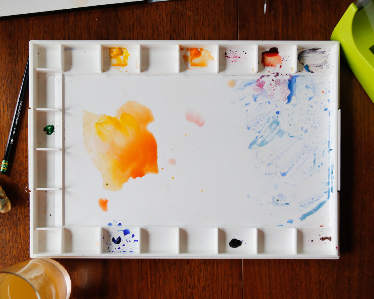
So how did we get there?
The process was simple: Endlessly toil away until they release you from your confines – wait…that’s the escape room we went to last week. The process for creating the design for the labels was pretty standard stuff – meet with the clients, discuss their goals, create preliminary artwork, get feedback, revise, get more feedback, revise, wash, rinse, repeat. You know, the usual stuff. But if you’re reading this far, chances are that you’re curious to know more about our process. And if that sounds like you, we’re more than happy to indulge.
Some background…
Dirigible Studio has been working with NessAlla Kombucha since 2014. During a meeting with Vanessa and Alla, NessAlla’s founders and owners, they mentioned future plans to roll out a line of CBD kombucha in addition to their regular offerings. To distinguish the new flavor lineup from their regular offerings, it was decided that we’d design a new label. Many brainstorming sessions later, a general concept was established, including names for the three flavors in their initial release.
Cousins, not siblings
It was agreed upon that the new design should be similar to NessAlla’s current artwork (which Dirigible Studio also worked on), but different enough to distinguish the CBD product line from the regular booch lineup. You know, cousins, not siblings. So, with that in mind, we took this liberty to veer from NessAlla’s current style guide to come up with a dramatically different design for their CBD labels. Blue skies all the way, baby.
A new look for Boochie
When sketching out ideas for NessAlla’s CBD kombucha, we kept Boochie in the mix. For those not in the know, Boochie is NessAlla’s mascot. Well, more than a mascot. A Patronus, if you will. Sometimes she’s referred to as the Booch Fairy. Over the years, she’s undergone a few makeovers.
Work on the new Boochie began as a hand drawn image.


We wanted to give Boochie a look that was recognizably human, though perhaps by way of some fantastical realm. Boochie has always had an untamed ‘do, so we retained that element. This choice was also partially inspired by Vanessa’s and Alla’s own hair (which we love). After reworking Boochie’s image to reflect feedback from Vanessa and Alla, we landed on the image shown here:

Using our words
Coming up with names, copy, and THE LIKE
Over the course of many months, countless emails, and a couple brainstorming sessions, a plethora of names for the flavors were bandied about. In the end, three names resonated with Vanessa and Alla: Magic Matcha, Butterfly Effect, and J-Hops.
Creating copy for the flavor descriptions was a collaborative effort. With plenty of guidance from Vanessa and Alla, the copy was shaped to have a poetic, mysterious feel, while still being playful and light.
le fin.
So there you go, folks. Concept to delivery, that’s how we created the label design for NessAlla Kombucha’s line of CBD-infused kombucha. These ladies are landing on shelves soon – we can’t wait to see them in the wild.
If you’re looking for a company to help with your company’s rebranding or any other marketing needs, drop us a line.
Published on Feb 11 2019
Last Updated on Feb 20 2023
Categories: Branding, Case Study, Graphic Design, Logos, News, Package Design
Tags: Art Deco, Branding, CBD, Design, Kombucha, Logos, NessAlla, Watercolor